
1.About Witsee
Witsee is a next-generation tracking solution designed to modernize the bowling experience. It functions as a digital bridge, turning raw physical movement into clear, technical insights through a seamless integration of sensor technology and AI.
While the industry has historically focused on simple scoring or complex, inaccessible data, Witsee focuses on Actual Performance. By providing a roadmap from raw data to real-world improvement, we are transforming bowling into a data-backed discipline where clarity and consistency are accessible to every player on the lane.
2.Positioning
Strategic direction
Witsee is the definitive bridge between raw data and technical mastery in bowling. By translating the invisible mechanics of every throw into a ‘shared language’ for coaches and players, Witsee shifts the focus from the final score to the consistency of the process. Operating as both a high-precision expert and a supportive mentor, the brand replaces intuition with objective clarity, providing the actionable guidance necessary to turn technical understanding into repeatable excellence.
The brand operates across two value territories:
Expert
Trusted authority in bowling training, emphasising accuracy and credibility.
Mentor
Supportive guide helping players understand and improve their technique.
Our role
The Witsee shot insight sensor is a high-precision, lightweight training device that transforms any bowling ball into a source of actionable intelligence. By pairing an in-ball sensor with an AI-powered app, it captures complex metrics – such as RPM, velocity, and axis tilt – to serve as a digital bridge that translates a player’s physical intuition into objective, technical performance for both coaches and athletes.
Our value
For coaches
Your coaching intelligence.
- Coaching multiple players with individual focus.
- Catching issues early without observing every throw in real time.
- Supporting players on days off-lane.
- Anchoring coaching in clear, understandable data.
For players
Your guide to a better shot.
- Understanding your shot.
- Improving your shot consistently.
- Trusting your shot in any conditions.
3.Logotype
The Witsee logotype represents the duality of bowling: the zen-like focus required to prepare for a shot, and the explosive climax of the strike. Below, you will find various versions of the Witsee logo, designed to help you communicate with the right tone and maintain brand consistency.

Logotype versions
Our logo is available in two distinct versions: a wordmark and a symbol. Below, you will find guidelines on how and when to use each variation.
WordmarkThe wordmark is our primary logo and should serve as the standard identifier for the brand. It is the preferred choice for formal communications, legal documents, letterheads, and all other official contexts where clear, immediate brand recognition is required.

SymbolThe symbol is the ideal choice for small-scale applications such as favicons, thumbnails, and social media profile pictures. However, its versatility means it also works beautifully as a standalone design element in broader brand communications and marketing materials.
Safe zone
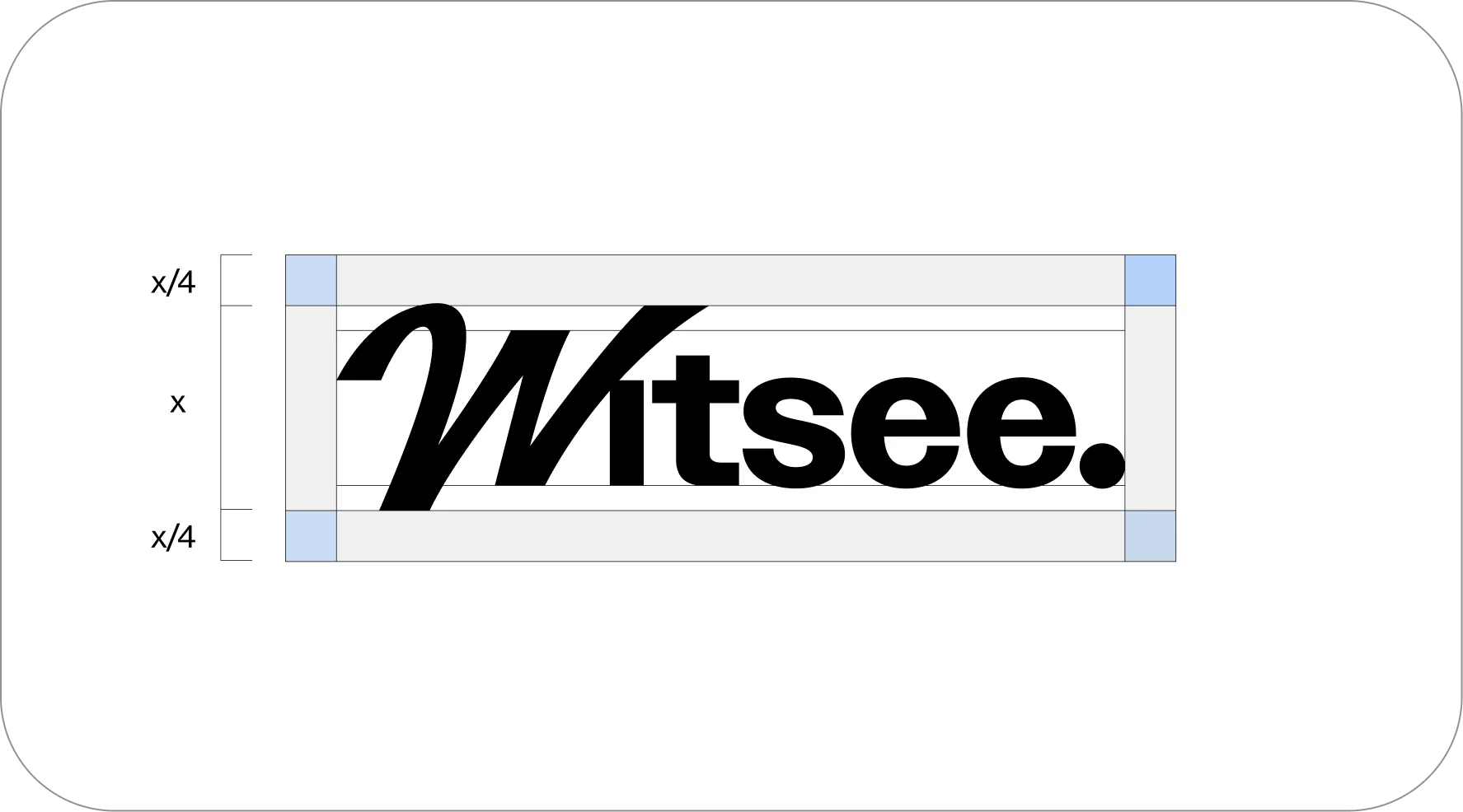
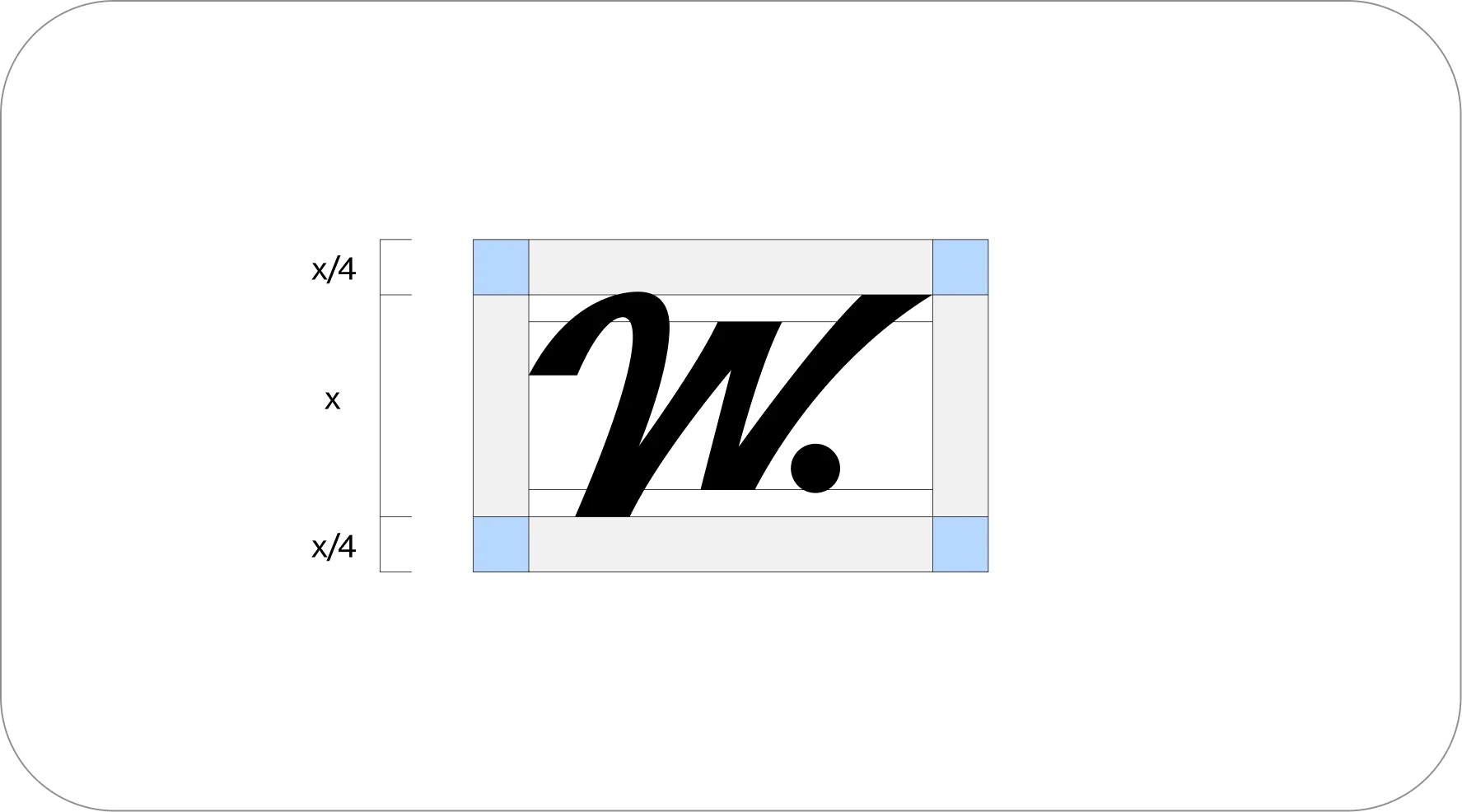
To ensure our logo remains legible and impactful, always give it room to breathe. The safe zone for both the Wordmark and the Symbol is determined by the height of the letter ‘W’ (represented as X).
The required clear space around the logo must always be at least one-quarter of the ‘W’ height (X/4) on all sides.
Minimum size
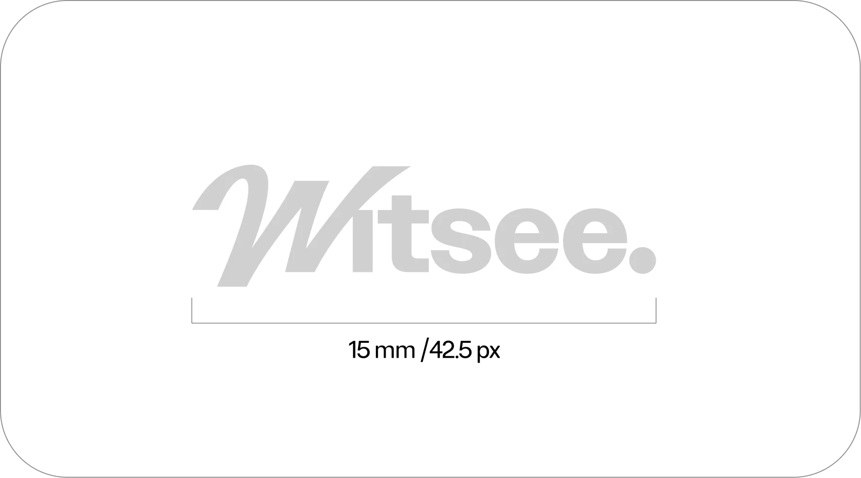
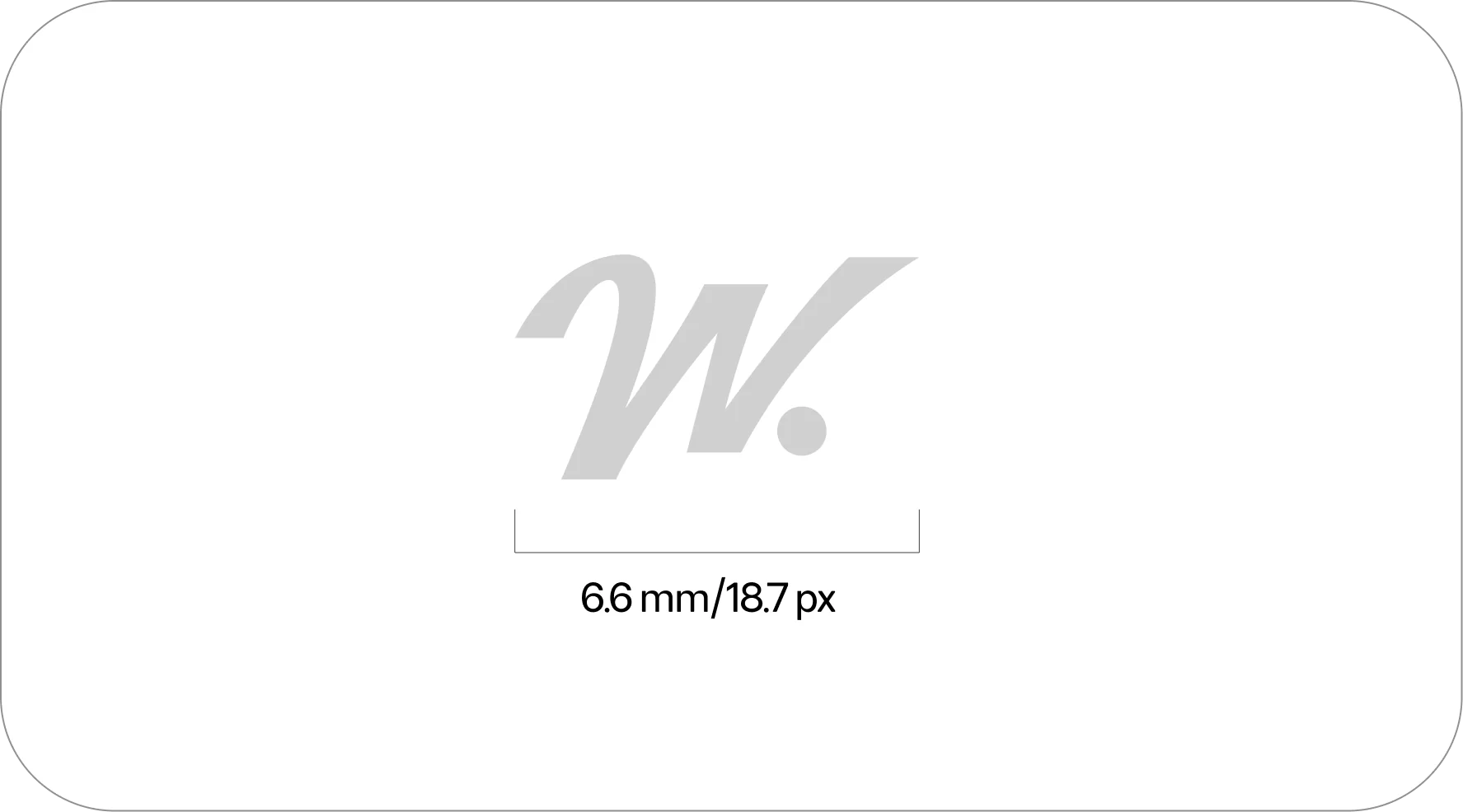
The minimum logo sizes shown below ensure readability across both print and digital media.
Logotype colors
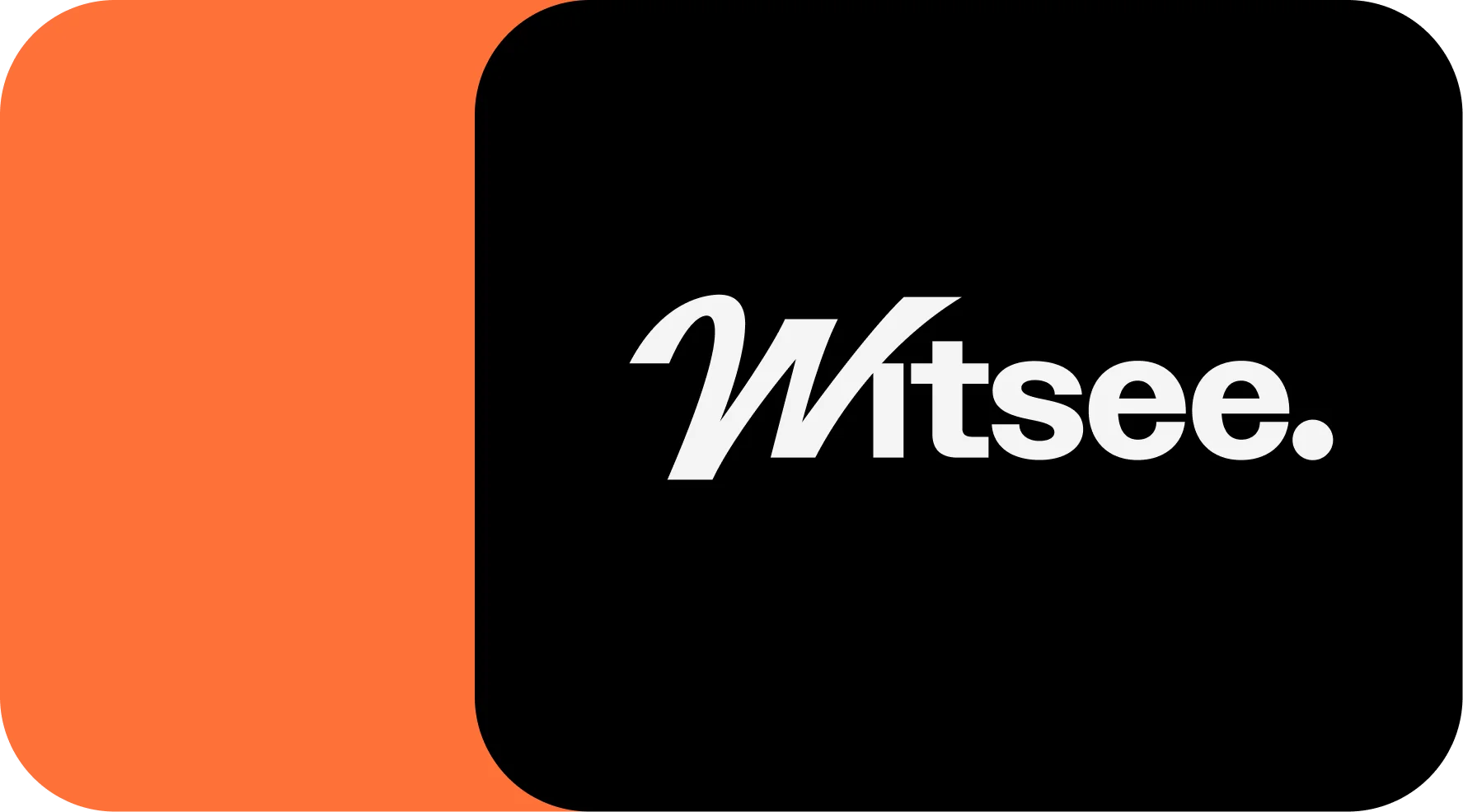
Both the symbol and the wordmark must be used exclusively in black or white. Below, you will find our guidelines for pairing these monochrome logos with our brand’s color palette.


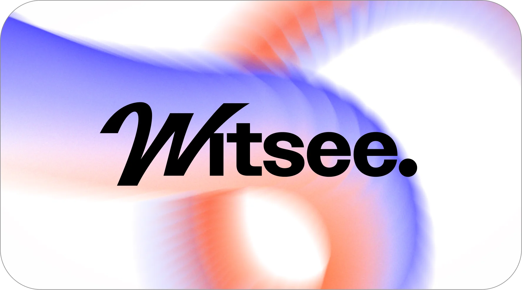
Correct usage
- The logo is placed on top of the graphic element.
- Only approved identity colors are used.
- The safe zone (clear space) is correctly maintained.
- The composition of the logo elements is correct.
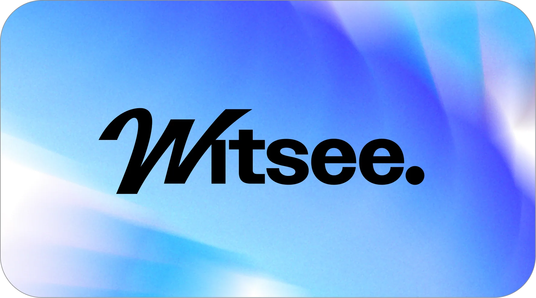


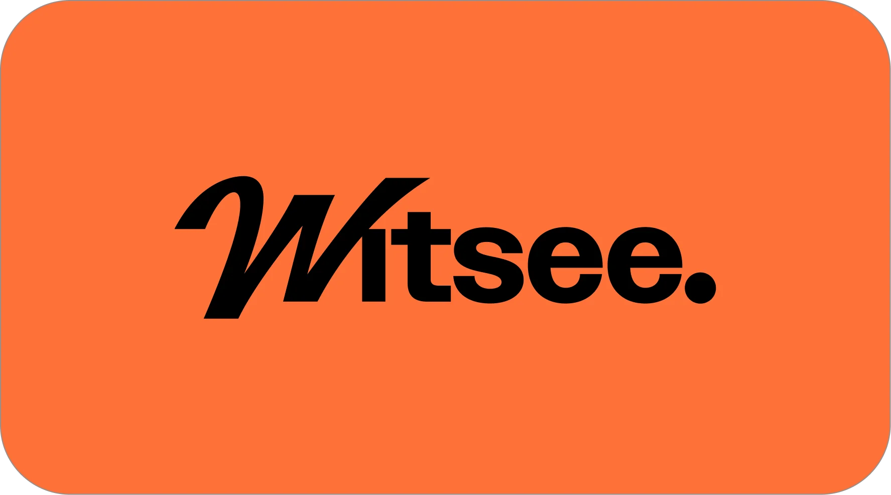
Incorrect usage
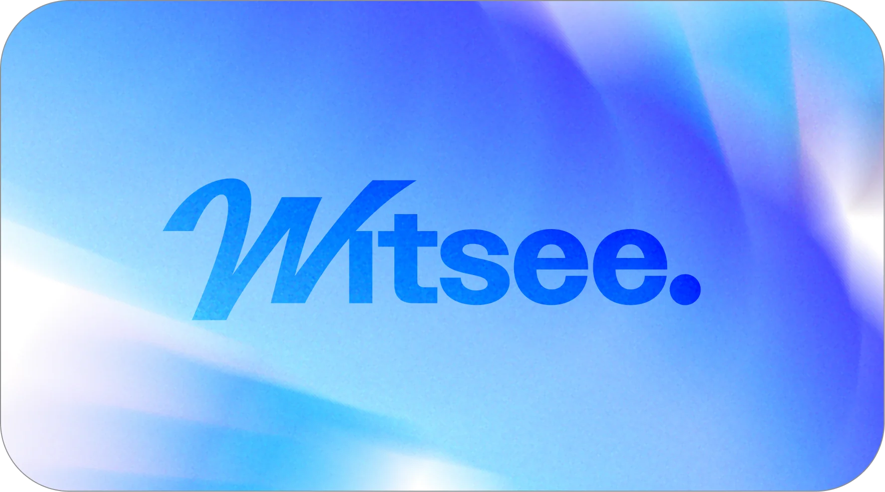
- Poor readability on various backgrounds and applied effects.
- The composition of the logo elements is altered.
- Insufficient clear space (ignoring the safe zone).
- The logo’s proportions are distorted.


4.Colors
Our color palette is an essential part of Witsee identity, uniting the logo, typography, and other visual elements into a cohesive brand system. Before using these colors, make sure the correct color codes are applied.
The Witsee color palette consists of four primary colors: light gray, dusk gray, white, and black. This palette helps convey a sense of professionalism, clarity, and modernity across all brand materials.
The identity also includes accent colors: light blue, bright orange and graphic element backgrounds. These colors are mainly used in communication materials, adding a sense of playfulness, energy and accessibility. While our blue and orange accents should always be anchored by primary colors, our graphic backgrounds offer more flexibility and can stand on their own.

Primary colors
When creating identity materials, use only the color codes specified here.
- Black and White are used for backgrounds, typography and the logo.
- Dusk Gray is used for backgrounds.
- Light Gray is used for backgrounds.
White
#FFFFFF
- RGB
- 255, 255, 255
- CMYK
- 0, 0, 0, 0
- Pantone
- White (no ink)
Light Gray
#F3F3F3
- RGB
- 243, 243, 243
- CMYK
- 5, 4, 4, 0
- Pantone
- Cool Gray 1 C
Cool Gray 1 U
Dusk Gray
#DFDFDF
- RGB
- 223, 223, 223
- CMYK
- 12, 9, 9, 0
- Pantone
- Cool Gray 2 C
Cool Gray 2 U
Black
#000000
- RGB
- 0, 0, 0
- CMYK
- 60, 40, 40, 100
- Pantone
- Black C (Coated)
Black U (Uncoated)
When creating or printing physical brand assets, always test that there are no significant shifts from the provided color palette. These may occur due to the product’s texture, printing methods, or other properties.
Supporting colors
Supporting colors are an important part of our communication, adding a sense of playfulness and accessibility. They are always used alongside the primary colors. Light Blue and Bright Orange are used in UI elements and backgrounds (e.g. divider slides in the presentation deck).
Light Blue
#A3CAFD
- RGB
- 163, 202, 253
- CMYK
- 38, 11, 0, 0
- Pantone
- 291 C (Coated)
291 U (Uncoated)
Bright Orange
#FF7139
- RGB
- 255, 113, 57
- CMYK
- 0, 66, 78, 0
- Pantone
- 1645 C (Coated)
1645 U (Uncoated)
5.Typography
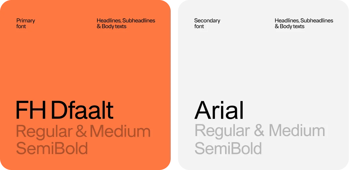
In our visual identity, we use the FH Dfaalt typeface. It is applied in communication materials, print, and other identity assets. This font is used universally – for headlines, subheadings, and body text.
When it is not possible to use our primary identity font (for example, in documents), FH Dfaalt is replaced with Arial.
Typography hierarchy
To ensure brand consistency, typography must follow the font styles and hierarchy described below. FH Dfaalt is always used for both headings and body text.
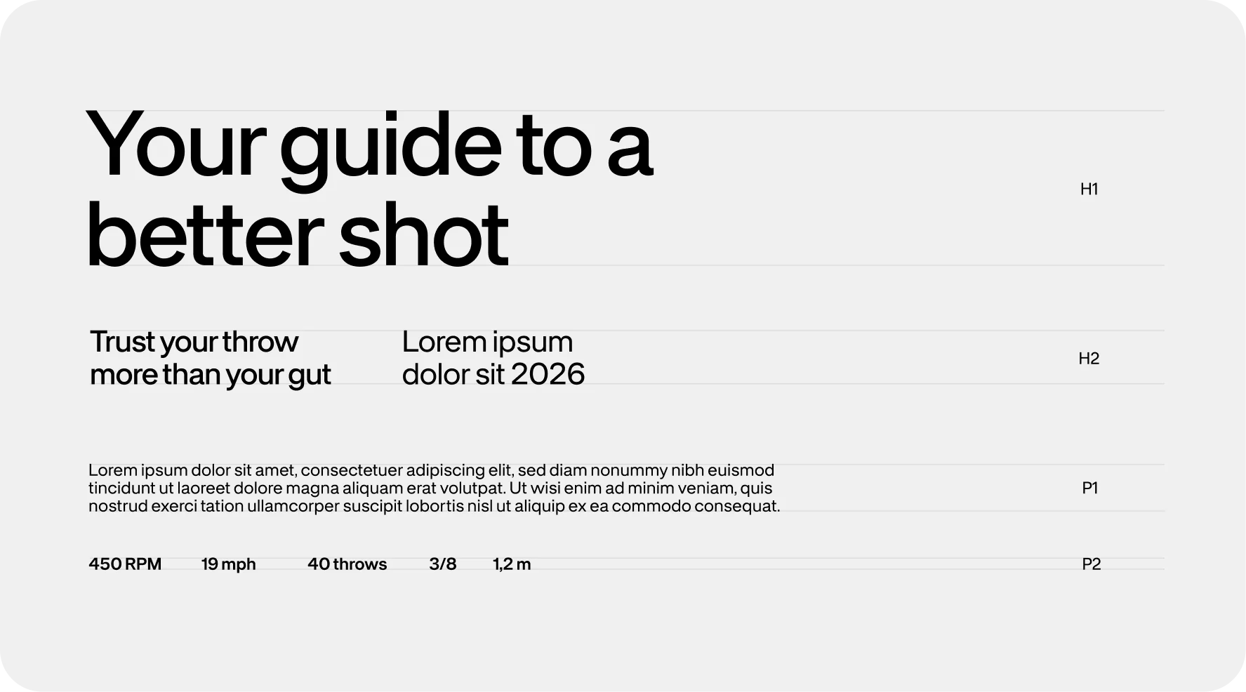
Primary font: FH Dfaalt
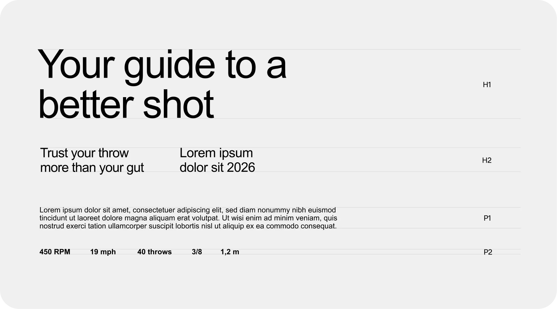
Secondary font: Arial
6.Photography style
The Witsee photography style is defined by high-contrast imagery and an “authentic-cinematic” aesthetic. By utilizing sharp lighting and deep shadows, the photography highlights raw textures – from the grain of a bowling lane to the intricate detail of a human eye. This style mirrors Witsee’s core values of clarity, precision and attention to details.
While the compositions often lean into a neutral, monochromatic base (grays and blacks), they are punctuated by vibrant pops of our accent colors – bright orange and light blue – found naturally within the environment.
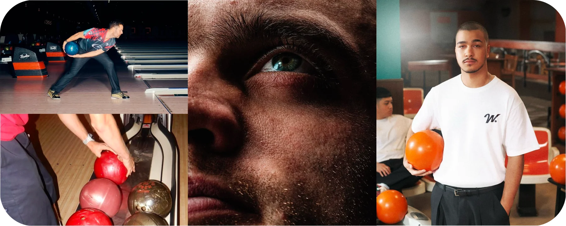
The images used in this guide are for illustrative purposes only. They show what kind of images should be selected from stock archives, as well as the desired lighting, composition, and narrative for newly created photographs.
7.Graphic elements
Gradient element
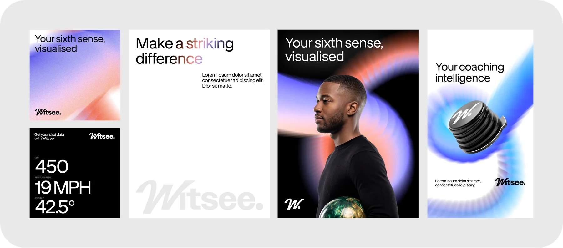
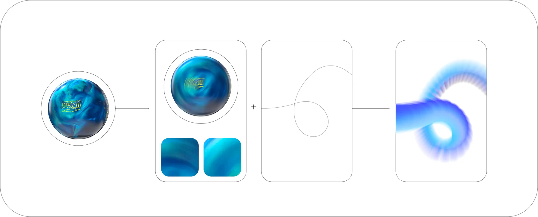
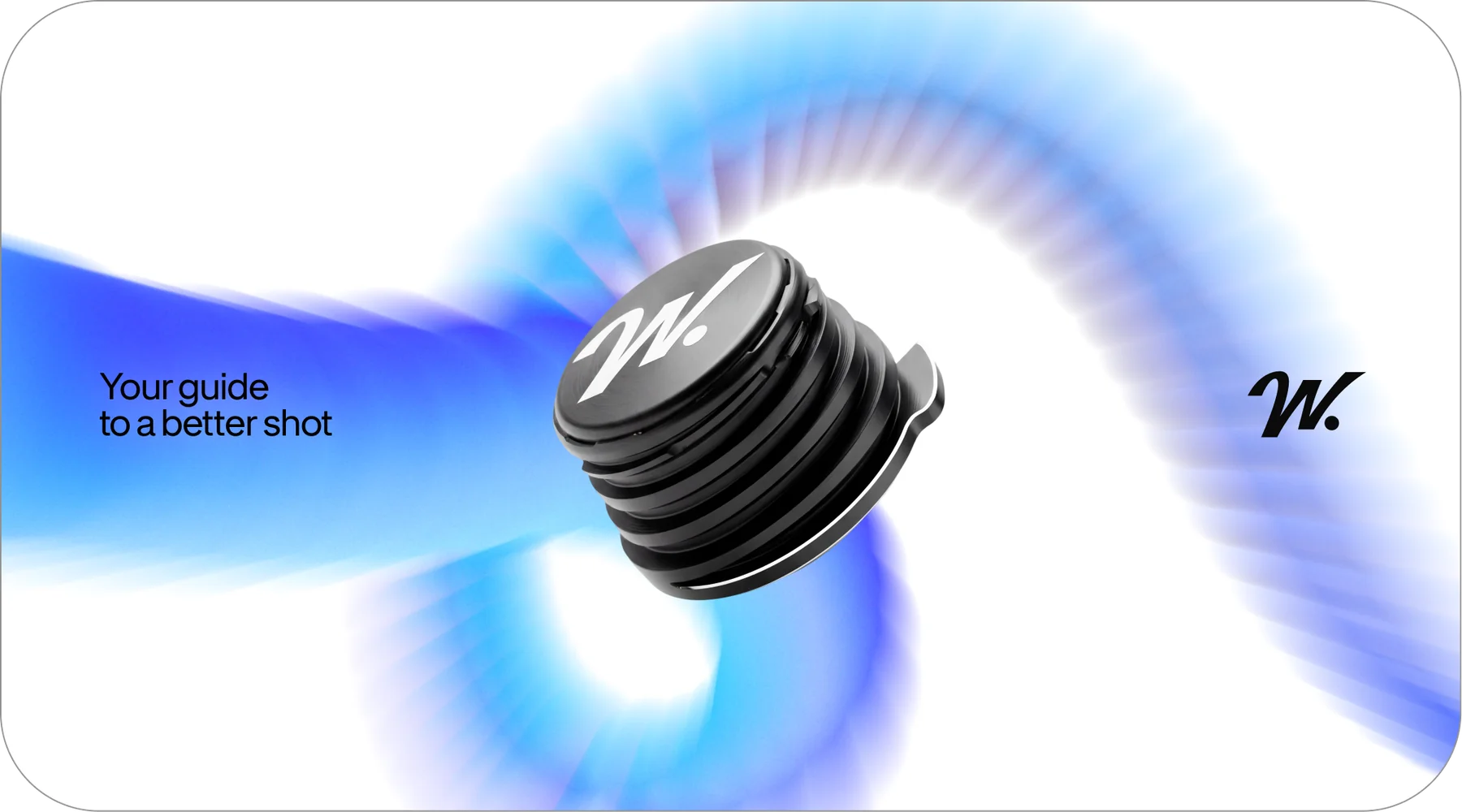
Our visual journey led us back to the bowling ball in motion. By translating the ball’s rotation into a graphic style, we found a balance between athletic tradition and modern flexibility. The final touch was capturing the energy of the bowler’s loop – an ever-changing, personal signature of the game. This evolved into a fluid, energetic graphic system that breathes life into the Witsee identity, effortlessly adapting to any medium.
Color combinations
We have developed two distinct colorways for our graphic elements to convey different brand moods.

BlueEmbodies a ‘zen’ energy: focused, calm, and professional.

Orange & PurpleDesigned for high-impact moments, offering a more dynamic and energetic aesthetic.
Graphic element in use
To ensure absolute versatility across all brand touchpoints, our core graphic element operates as a dynamic, four-part system. Rather than a static asset, this fluid element adapts to different contexts while maintaining strict visual cohesion, allowing us to scale the brand’s energy up or down as needed.
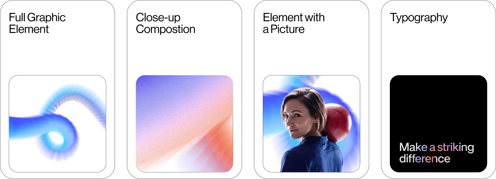
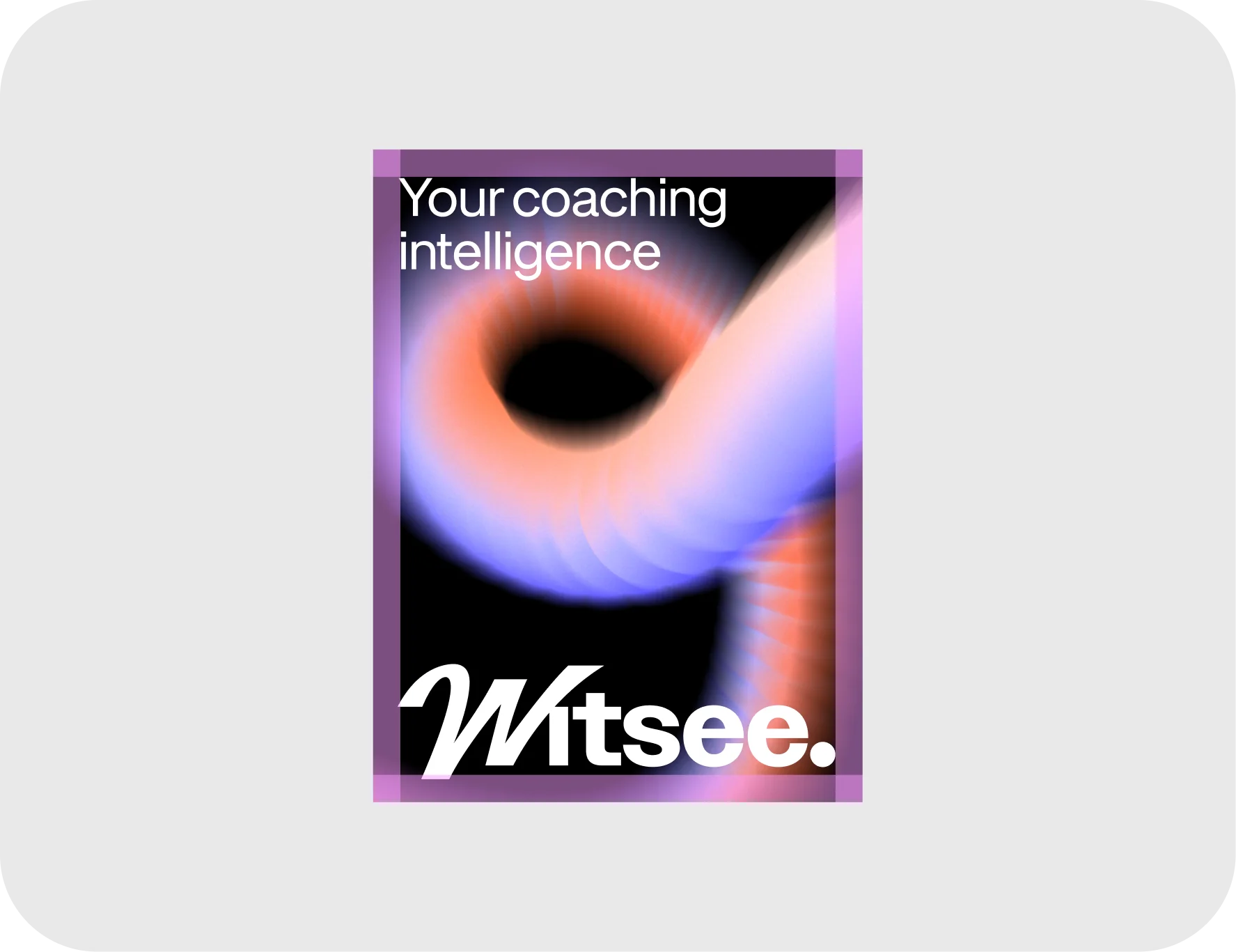
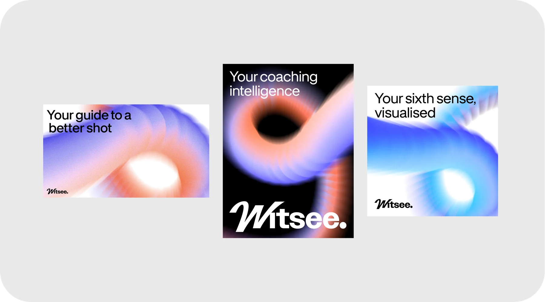
Full Graphic ElementOur primary visual asset and the core expressive anchor for the brand. The preferred choice for high-impact layouts, hero sections, presentation covers, and all other communications where a bold, dynamic visual presence is required.
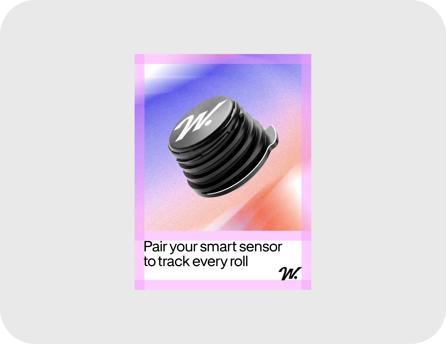
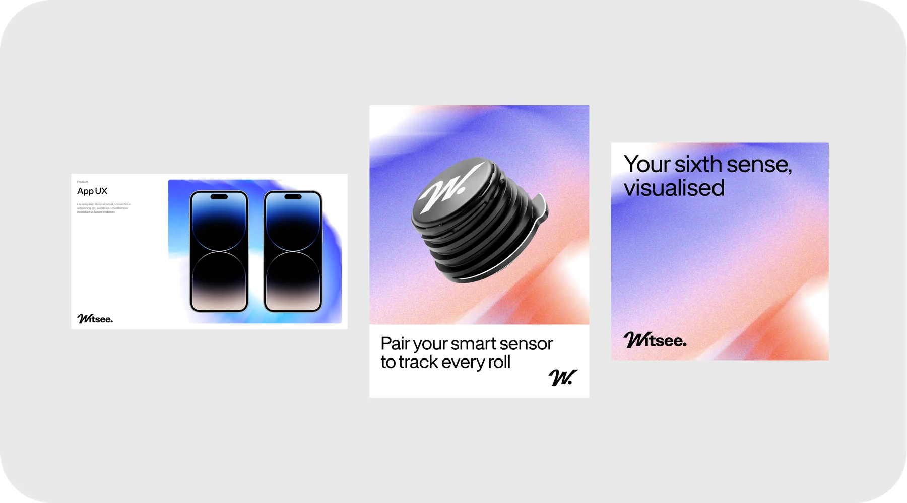
Close-Up CompositionThe standard atmospheric backdrop for the brand. The preferred choice for product showcases, digital interfaces, informational cards, and all other layered contexts where rich brand energy, without distraction from the primary subject, is required.
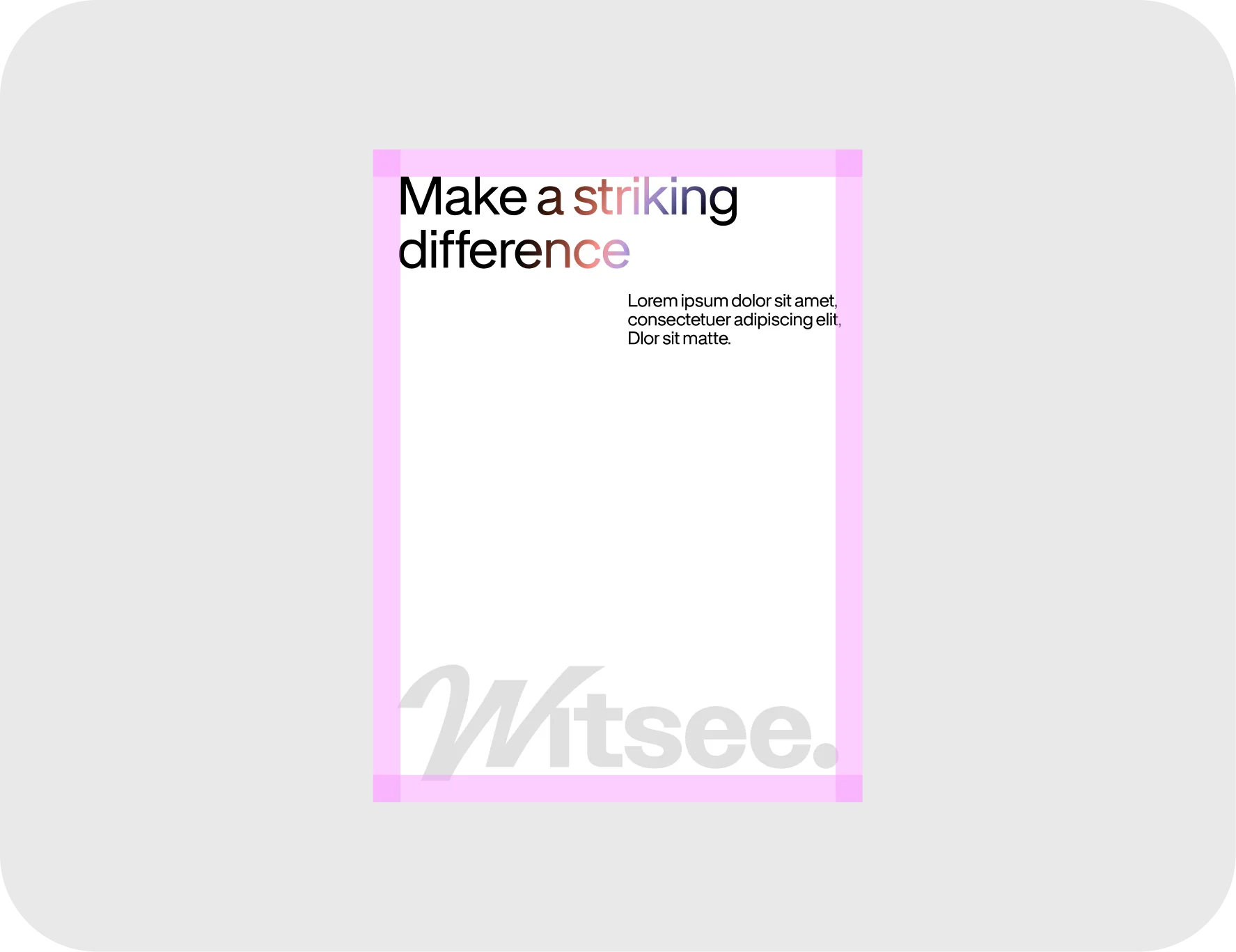
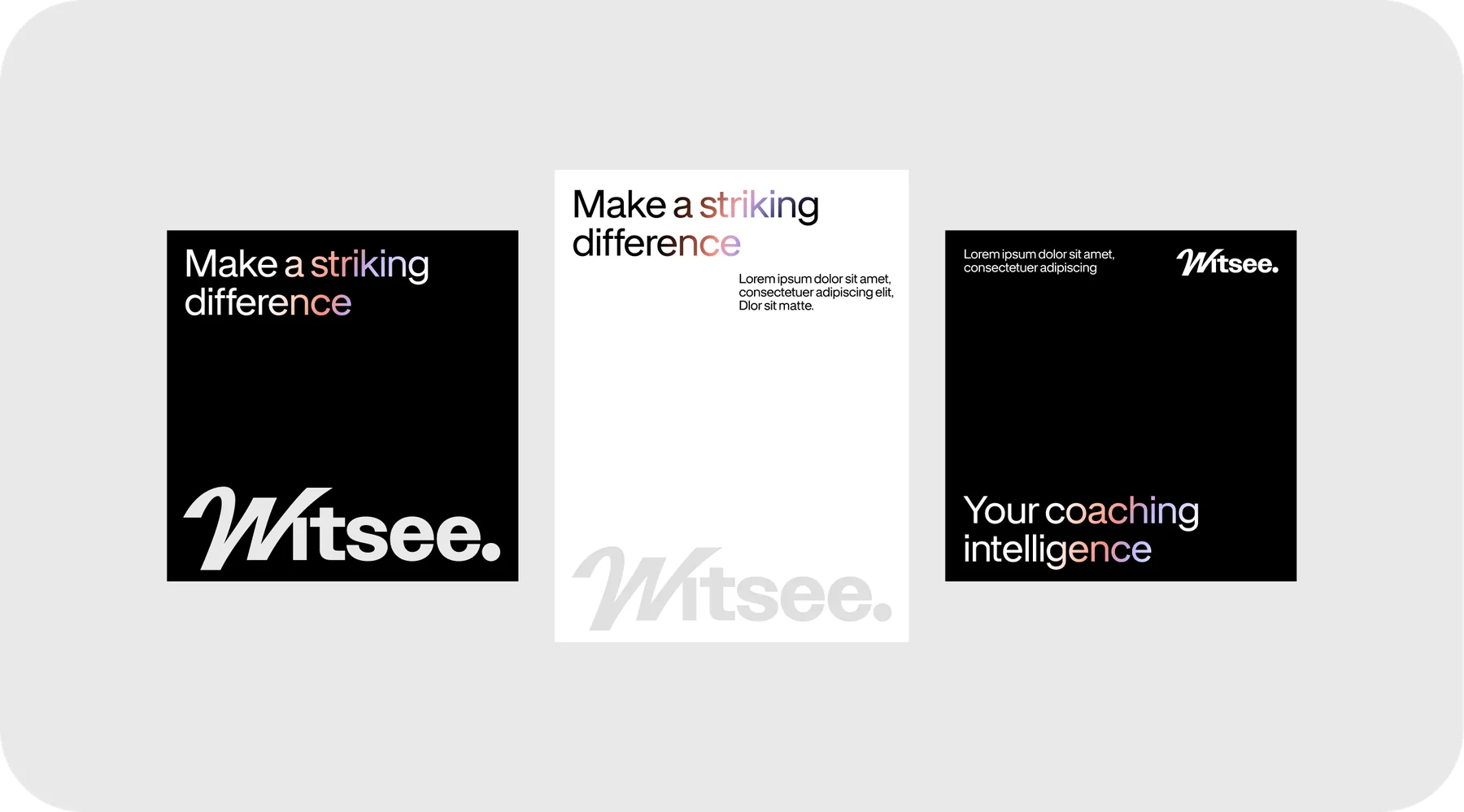
TypographyA great way to balance the colourful layouts. The preferred choice for prominent headlines, campaign slogans, key statements, and all other copy-driven contexts where highlighting specific words and injecting visual energy into written communication is required.
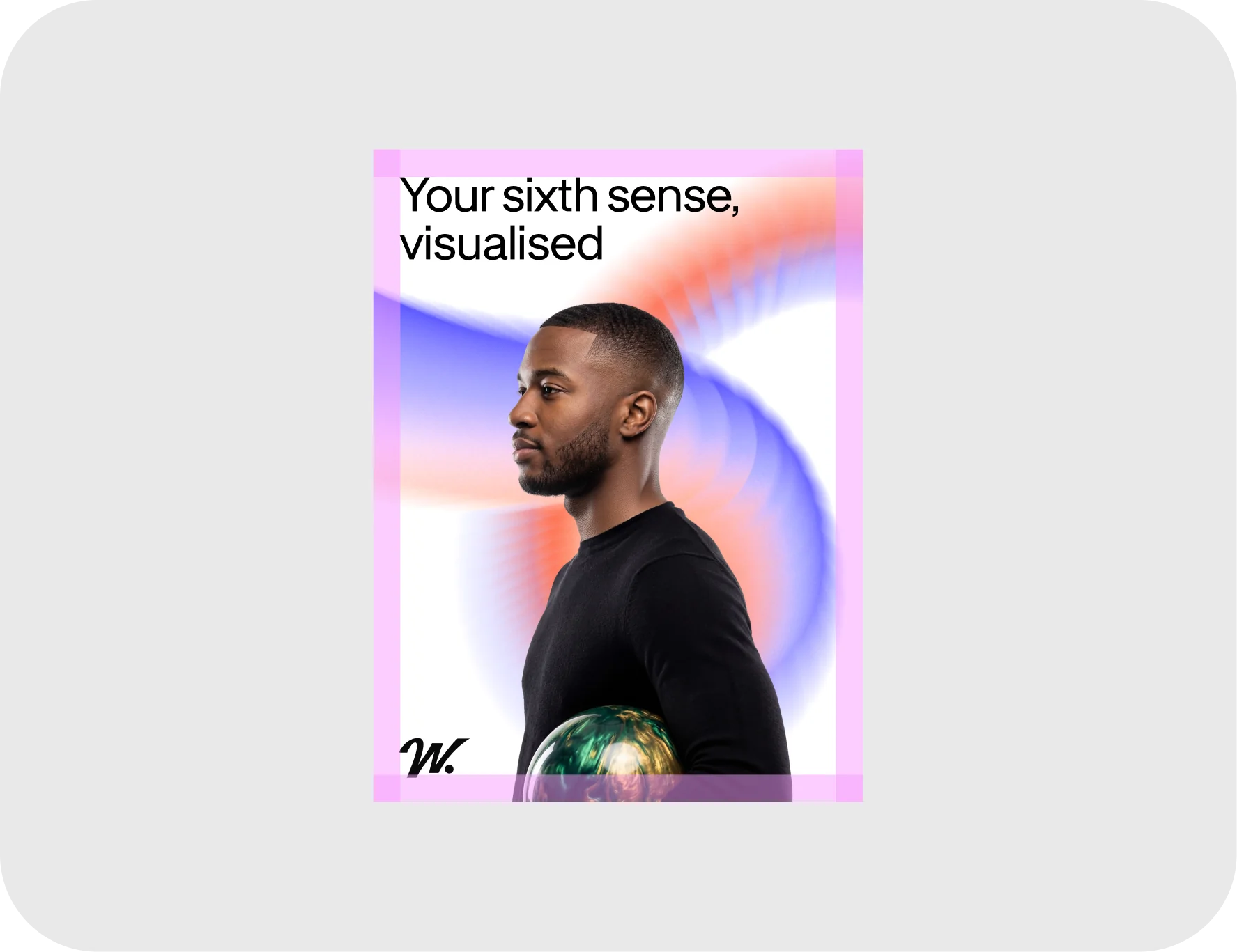
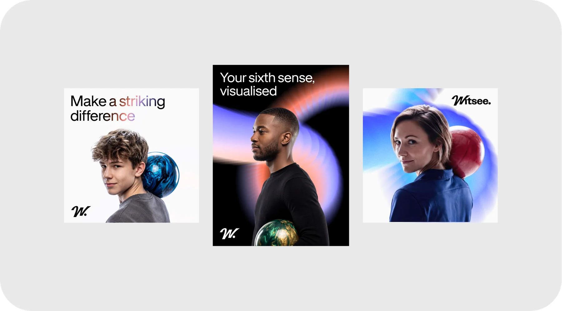
Usage with PhotographyIntegrating the graphic element as a dynamic backdrop creates our signature branded photography for players and coaches. While our standard photography style captures everyday event coverage, this elevated approach projects a deeper sense of intelligence and professionalism.
Supporting elements
Drawing inspiration directly from classic bowling culture, this supporting visual element captures the nostalgic energy of the lanes. We’ve reimagined the loud, expressive typography and triumphant screen animations that follow a perfect strike. This bold style injects moments of high energy and pure celebration into the brand.
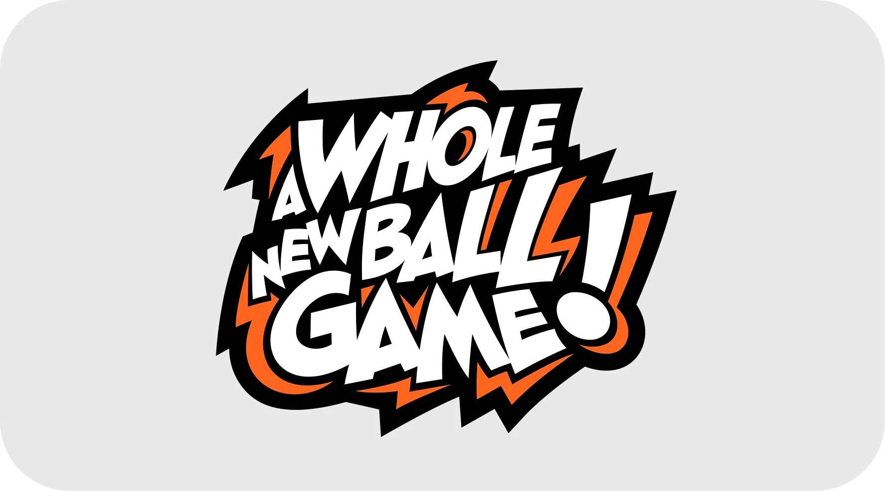
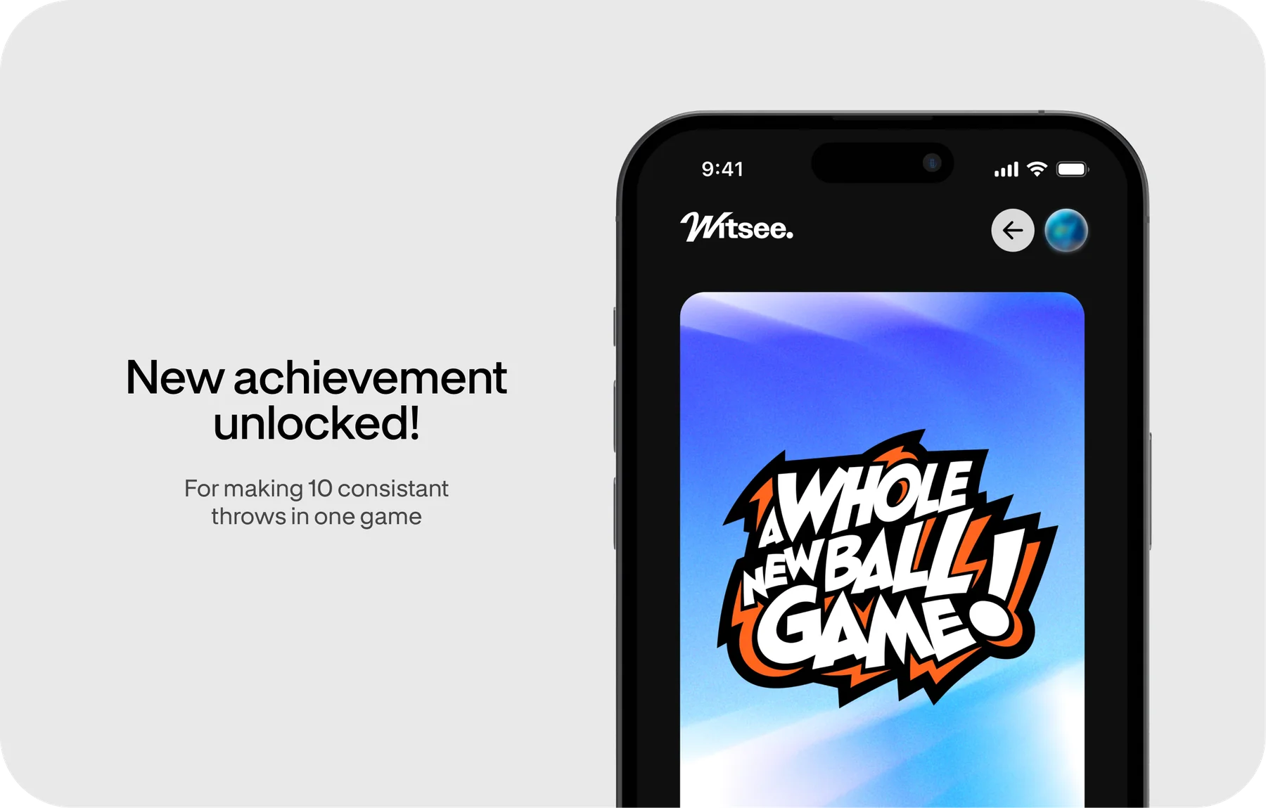
Supporting ElementIntended for use in the app, as an achievement or to celebrate the player’s progress.
Layouts
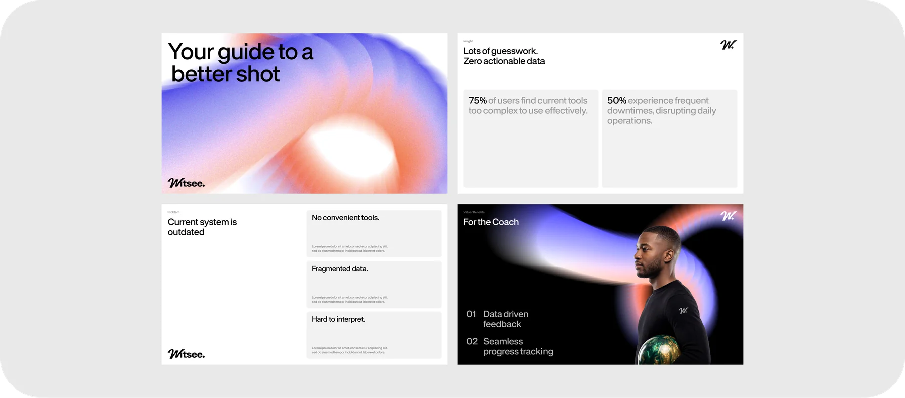
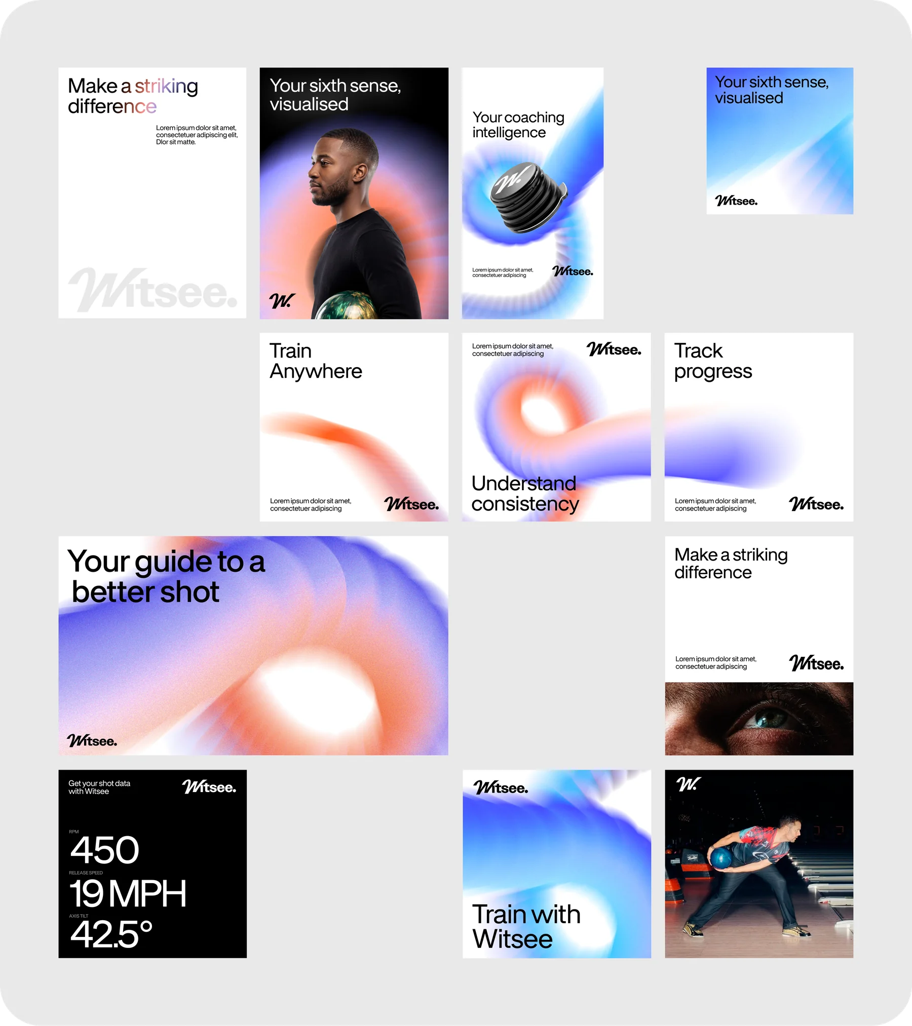
Our brand identity elements – logo, typography, color palette, graphics, and photography – come together in our layouts. The examples below demonstrate how we can easily adapt them to different formats and use cases.
Don’ts
To maintain brand integrity and ensure visual consistency, it is just as important to understand what to avoid. Adhering to these guidelines is essential for keeping our brand identity strong and intact.
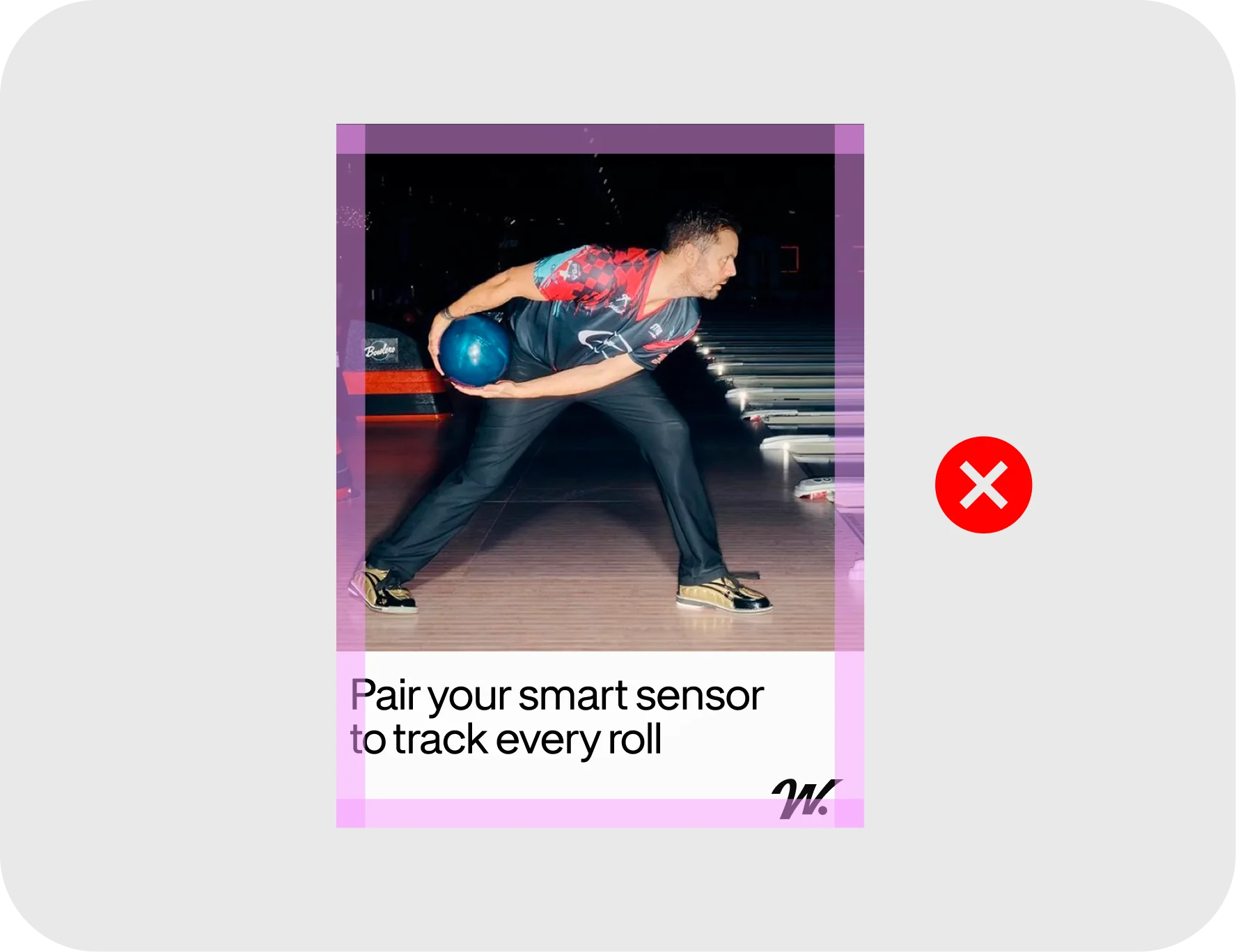
Not aligned to marginsAlways respect the layout’s structural grid. Do not allow typography, logos, or other essential content to encroach upon or bleed into the defined margin safe zones.
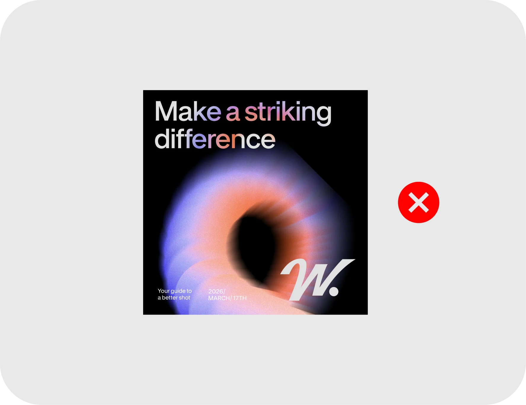
Gradient type with graphic elementDo not combine gradient typography with the full gradient graphic in the same composition. Choose one primary brand element to lead the design.
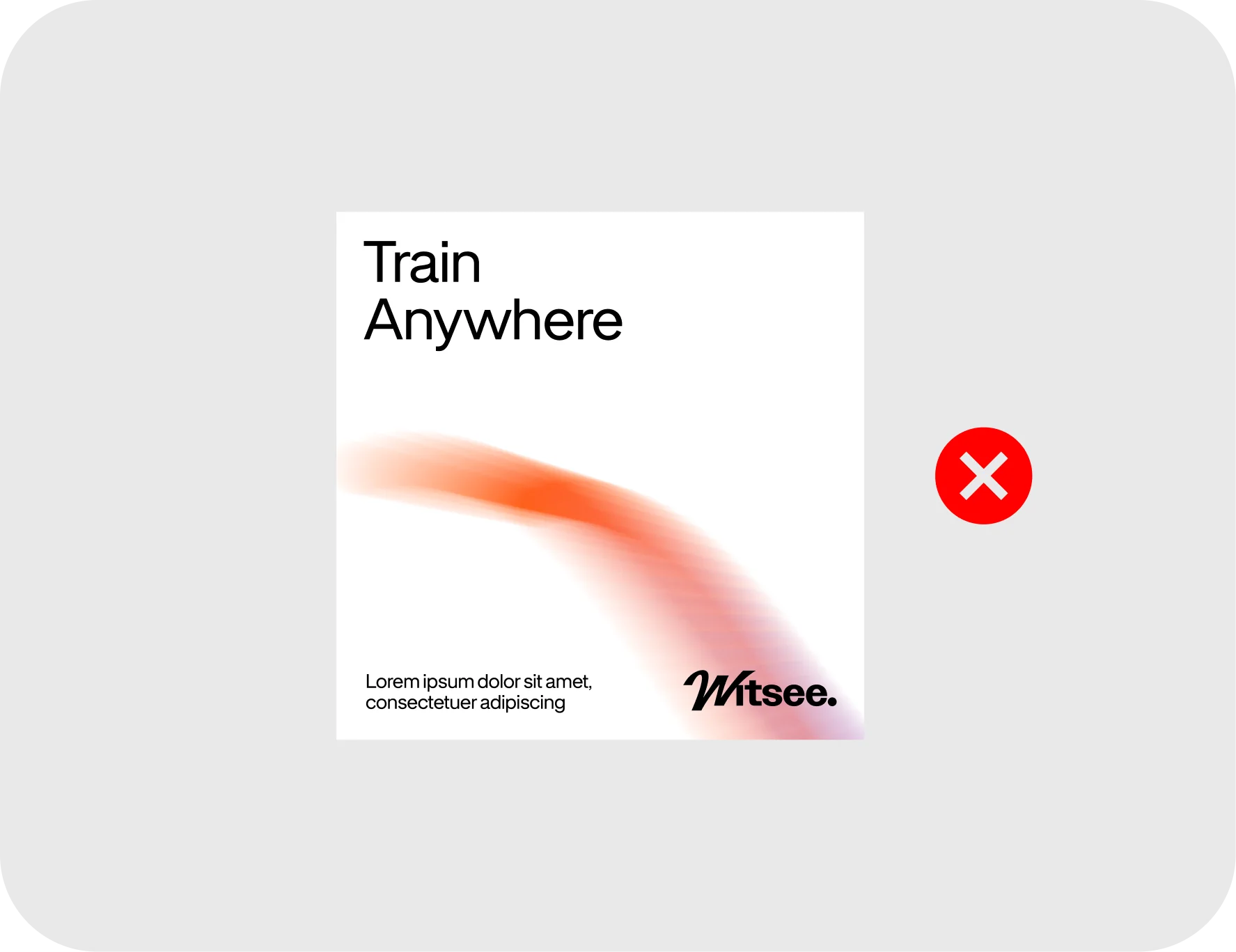
Carousel slide used as oneNever use a multi-slide carousel layout from the package if you are only posting a single image.
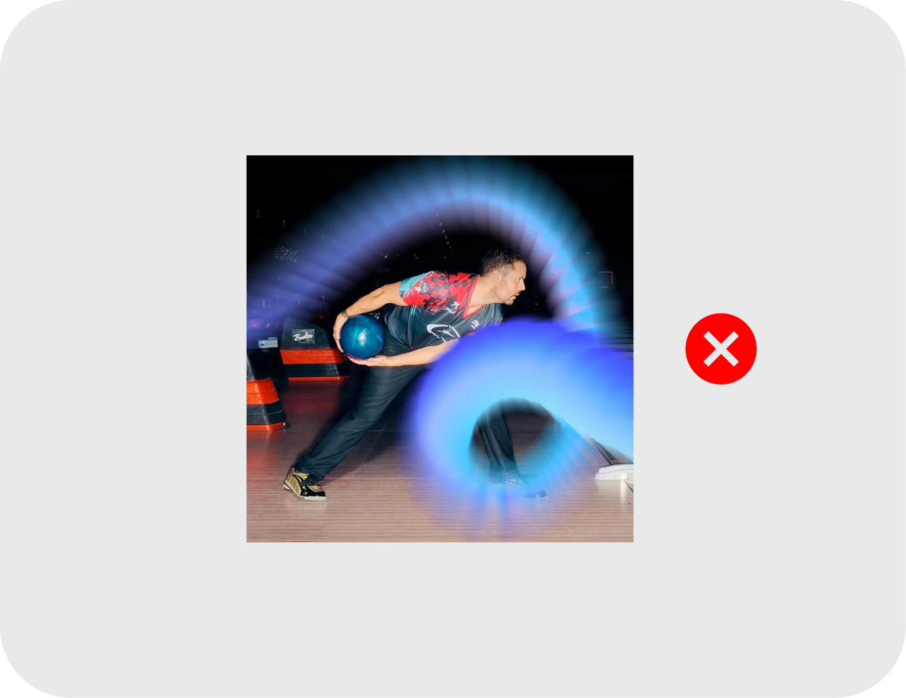
Graphic element on imageDo not overlay graphic elements directly onto lifestyle photography or wrap them around subjects. Let clear photography remain unobstructed.
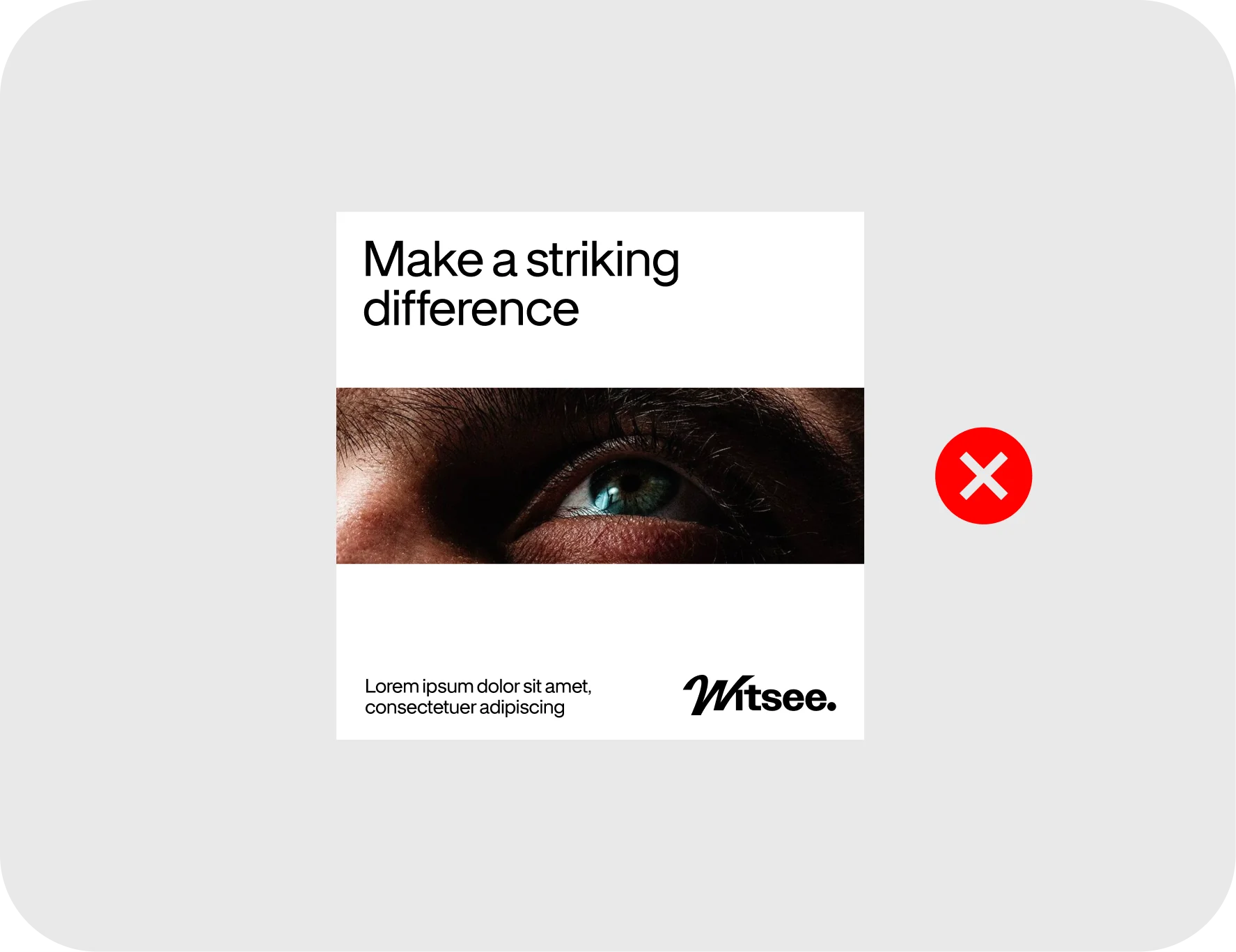
Image block in the middleDo not create new layout compositions or structural grids from scratch. Always use the pre-approved templates within the social media package.
8.Adaptations
Social templates